
Corporate Visions
Subscriber Portal Redesign

Portal requires a subscription to view
UX, UI, and Visual Design
Problem Overview
Corporate Visions is a leading marketing and sales messaging, tools, and training company that uses science-based techniques to make companies more profitability by improving the conversations salespeople have with customers. They asked me to redesign their Subscribers Portal using wireframes created internally. Upon review, these wireframes also needed improvements, but without the time or budget (approximately 30 hours) for a full UX audit, I worked closely with two stakeholders and a WordPress developer to deliver the best short-term solution improvement within the existing framework.
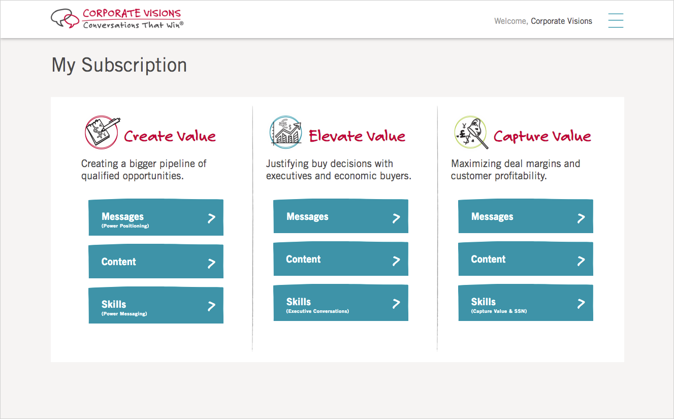
Old Subscriber Portal
The old portal was mainly a jump-off point to get to each of the subscriber's training material. The content and links available are dynamically generated depending on the training tier. The main challenge that was out of scope for this project was to create some unity given the reality that many of the links launch a different web tool or a Sharepoint directory.

Analytics-based Wireframe Recommendations
Before making any recommendations I asked to see some high-level data from Google Analytics to verify that the wireframes provided were in line with the usage patterns. The data allowed us remove the Quick Links and move only the useful links to the footer and organize them by category. I then made quick post-it note recommendations directly on to the wireframes and jumped on a video call with the client to walk through the changes. Because the client was technically familiar with the product we were able to compromise on the most feasible changes that had the most impact.

Client provided wireframes with my recommendations

Google Analytics usage report
Sketching and Sketch App Mockups
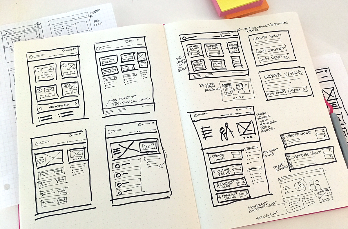

In order to stay within budget, the client took my recommendations and returned a revised set of wireframes from which started freehand sketching to quickly map out the main areas of content based on hierarchy. I moved to the Sketch app and rendered a first draft of two directions – one that hewed closely to the wireframes, and another that highlighted the same content while also giving the portal a visual sense of place and the ability to keep the content updated and fresh. All of the mockups were reviewed on Invision.
Round 1
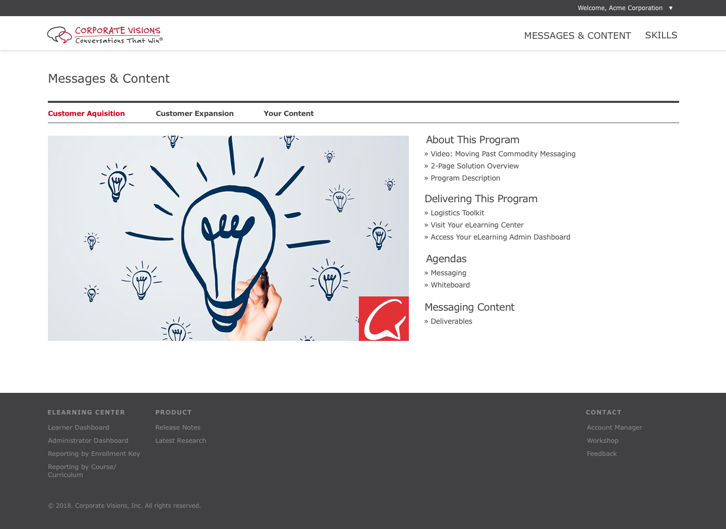
Version A emphasized the 4 core skills that are part of the company's sales training program. Using their existing colors to distinguish each funnel, this version provides easy access to links and content without showing a stack of buttons.

Portal Home

Category Landing Page
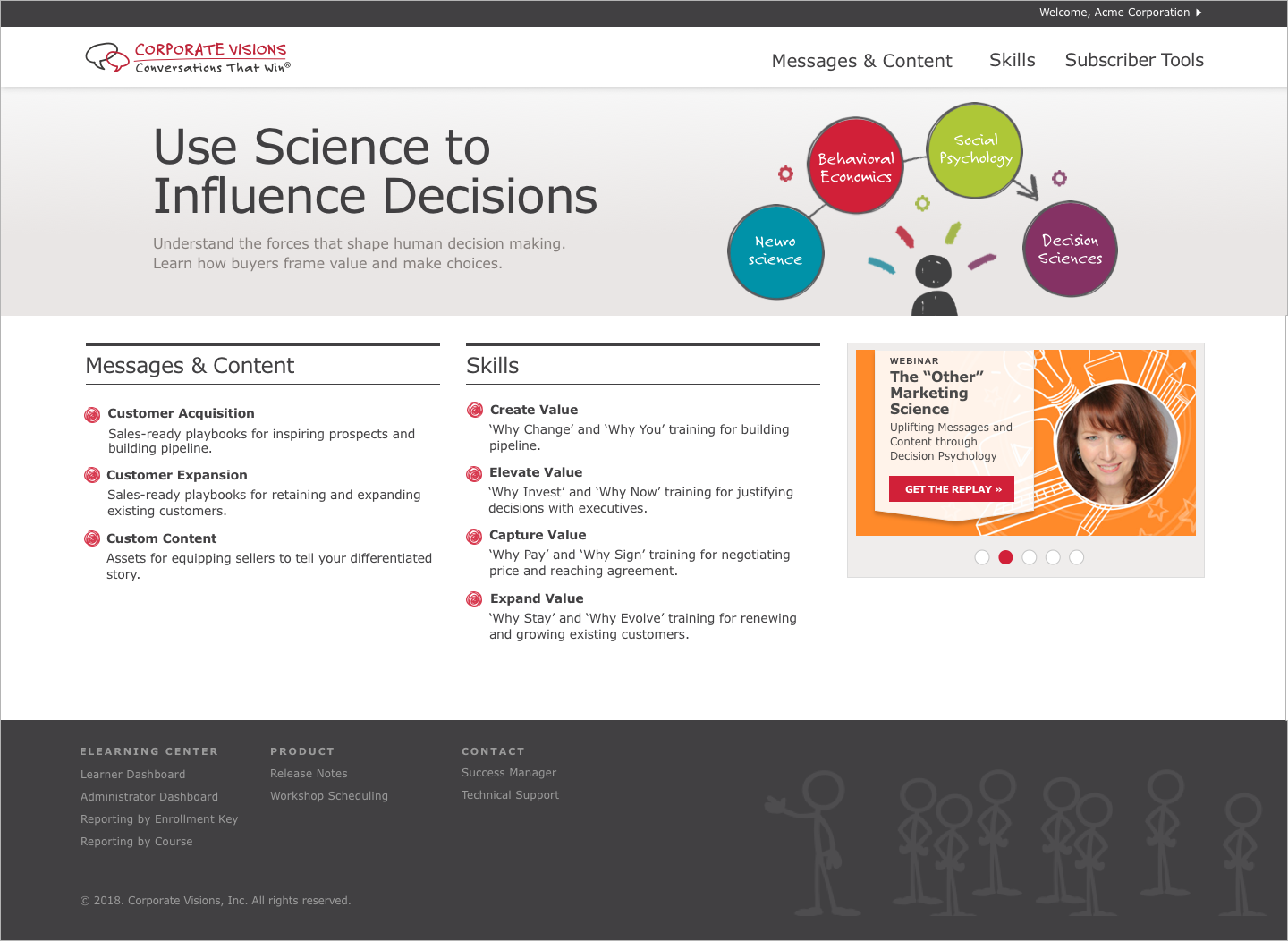
Version B shows how the portal home could also be a place to make service announcements and allow for content to be updated more often. The category landing pages were also designed to allow for more explanation and add visual interest while still making the links available above the fold.


Round 2
The overall comments from round 1 was that they liked having a hero image, but that it was taking up too much space above the fold. They also felt there was too much weight on the core skills and that the color coding was creating visual noise. Round 2 addresses all of these needs and creates more parity between the core Skills and the Messages and Content. The category landing page was also simplified as some of the recommendations I made were out of the scope of development.

Final
The final version went through several incremental updates in order to incorporate more of CVI's branding elements. The hero area would eventually be owned by the content team to generate new graphics over time. The rotating carousel would also highlight upcoming workshops and seminars. The majority of subscribers access the portal on their desktop office computer so while effort was made to ensure core responsiveness to mobile, some features were not optimized for this view. The Quick Links were removed and the main links displayed prominently. Some links were removed entirely due to lack of engagement or moved into the footer. A subscriber profile dropdown was also added in the header for account-related information and to log out.
Before


After


Summary
The results were well received by all of the stakeholders and as a result I was asked to redesign additional components and tools in the company's ecosystem. In the coming months there will be analytics available to measure the new engagement as well as a survey of beta clients to gather some qualitative feedback. Results will be summarized here as they come in.